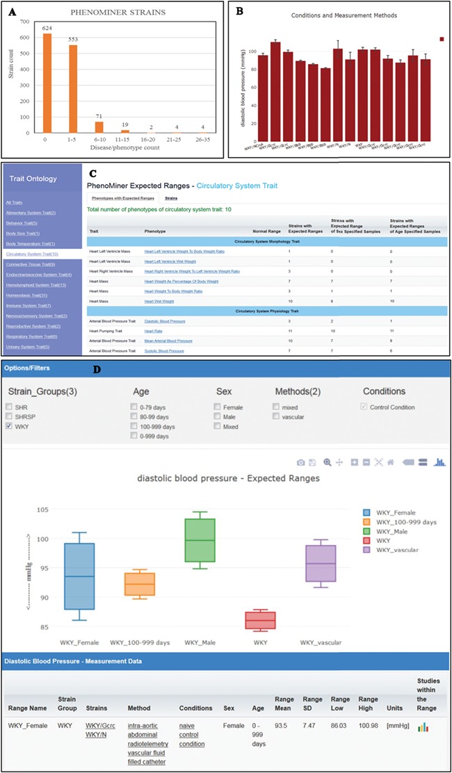
Figure 4.

(A) The disease/phenotype annotation distribution of strains with PhenoMiner data. More than half of the PhenoMiner strains have at least one disease/phenotype qualitative annotation. (B) The result page in PhenoMiner after querying WKY strains for diastolic blood pressure, using specific measurement methods under control conditions. The bar chart displays all the matched records in the PhenoMiner database. (C) Summary of the traits for expected ranges analysis is listed on the left and the list of the available expected ranges under the selected circulatory system trait is shown in blue font. Each phenotype is hyperlinked to the associated expected ranges data. (D) The expected ranges of diastolic blood pressure of the selected WKY strain group. Each color-coded box is an interquartile range graph in which the data median is shown as the line in the middle, the third quartile is shown as the top and first quartile is shown as the bottom of the box. Maximum value is represented by the horizontal bar above the box and the minimum value is represented by the horizontal bar below the box. The calculated expected ranges data associated with the displayed graphs are listed at the bottom of the graph, and the links to the original PhenoMiner records are also provided.
