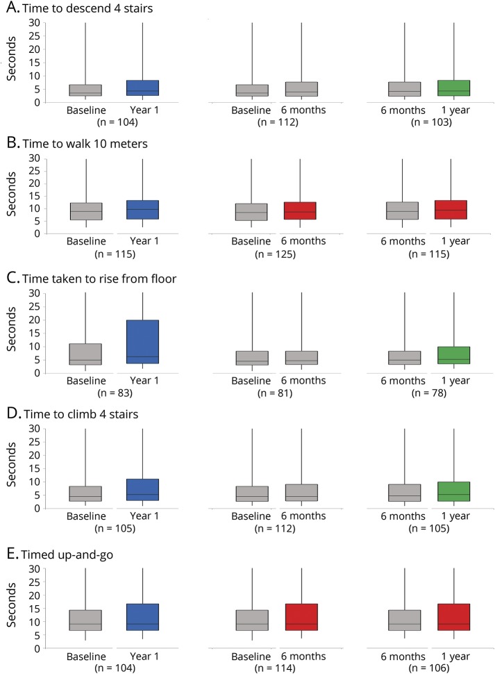
Figure 2. Change in timed tests over 6 months and 1 year.
Boxplots showing range, interquartile range (IQR), and median values of time taken to perform timed tests. Paired comparisons of calculated velocity (1/time in seconds) were used to determine significant vs insignificant change in order to include those unable to complete the test. These are displayed as time taken to complete each task (rather than velocity) to aid visual interpretation. Comparisons of baseline and year 1, baseline and 6 months, and 6 months and 1 year are shown. The numbers differ depending on the number of patients completing each test at both visits. Blue shows significant change (p < 0.05) over 1 year; red shows if change is seen over both 6-month periods; and green shows change in only the green 6-month window. Some patients were very slow, and those taking >25 seconds to complete a test are not displayed but are included in median and IQR calculations.

