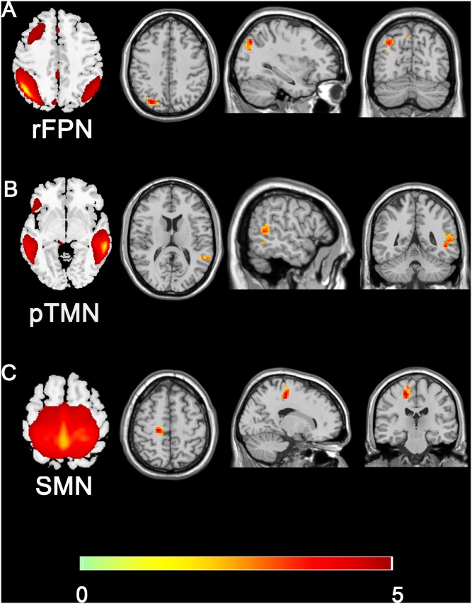
FIGURE 3.
Group difference distributions of intra-network FC between SNHL group and control group (A–C). Warm colors indicate regions with higher intra-network FC in SNHL patients compared with healthy controls (p < 0.05, Gaussion Random Field Theory corrected). The colorbar in the bottom shows the t values from the between-group comparison. The schematics of each seed network obtained from ICA were shown in the left of each panel.

