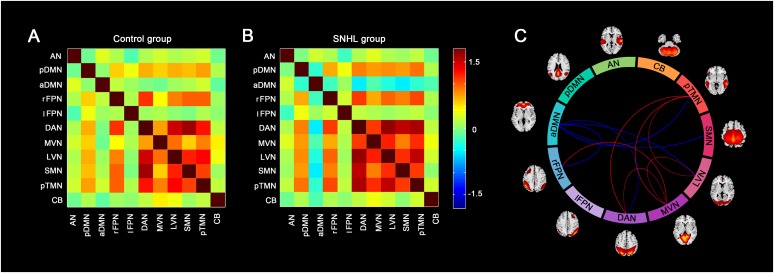
FIGURE 5.
Group difference in the inter-network FC between the SNHL group and control group. (A,B) Shows the group averaged FC matrices of the z scores for each pairs of networks derived by ICA in the control group and SNHL group. The heat map next to panel B shows the z-score distribution of group-averaged inter-network FC. (C) Show the between-group differences in the inter-network FC. Eleven arcs in the big circle with different colors denote different RSNs used to calculate the FC values. The lines connect the arc pairs represent significant differences in the FC between corresponding RSN pairs (p < 0.05, corrected by FDR). Blue lined denote significantly decreased inter-network FC, red lines denote significantly increased inter-network FC in the SNHL group compared to the control group. The brain maps next to the arcs are the schematic representations of the RSNs derived from ICA.

