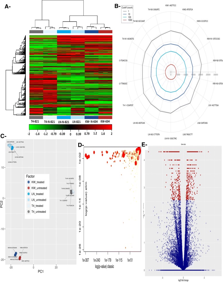
Fig. 6.
a- Heat map and unsupervised hierarchical clustering by sample and genes were performed for the listed samples using the 500 genes with the largest coefficient of variation based on FPKM counts. Data were based on samples from the treated and untreated groups. The results were based on the normalized FPKM (abundance) for each gene for each sample and a b- radar plot showing the number of genes identified for each sample at different fragment count cut-off values. See the color scale at the top of figure for the specification of fragment count cut-off values. c- Principal component analysis (PCA) plot for treated and untreated cells. PCA was performed on all samples that passed QC using the 500 genes with the largest coefficient of variation based on FPKM counts. Each circle represents a sample. Treated KW cells were separated better than 821-T4, which was not well separated, and 821-LN, which was moderately separated. d- Scatter plot showing significantly enriched GO terms associated with genes that were differentially expressed between treated and untreated cells. The plot shows a comparison of results obtained with the two statistical tests used. Values along diagonal line were consistent between both methods. Values on the bottom left of the plot correspond to the terms with the most reliable estimates using both methods. The size of a dot is proportional to the number of genes mapping to that GO term, and the coloring represents the number of significantly differentially expressed transcripts corresponding to that term, with dark red representing more terms and yellow fewer terms. e- Volcano plot showing the relationship between the p-values and the log2-fold change in normalized expression (FPKM) between treated and untreated cells; Data are based on the normalized FPKM (abundance) for each gene per sample

