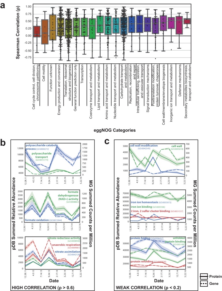
FIG 3.
Functional categories with strong or weak genomic prediction of proteome fluctuation. (a) Box plot demonstrating the distribution of Spearman correlations for each gene with an associated eggNOG functional category. The Spearman correlation (ρ) between the summed metagenomic counts per million per time point and the average relative abundance of associated metaproteomic protein is displayed. Summary statistics for these data can be found in Table S1. (b) Summed GO categories with strong genomic and proteomic correlation. (c) Summed GO categories with weak genomic and proteomic correlation.

