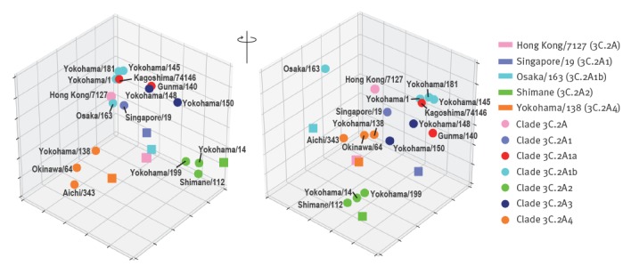
Figure 4.
An antigenic 3D map of influenza A(H3N2) viruses, Yokohama, 2016/17 and 2017/18 influenza seasons
An antigenic 3D map was generated from the neutralisation data in Table 1. Viruses are represented as circles and antisera as squares. Strains are coloured based on the clades. The grid indicates one unit of antigenic distance, a twofold dilution in neutralisation titre.

