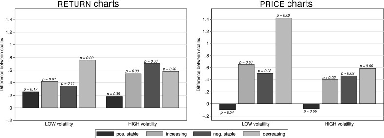
Fig. 4.
Differences in average perceived risk (in NARROW minus WIDE) by trend and scale presented as charts (left) and charts (right). This figure depicts differences in average perceived risk (on a scale from 1 = “not risky at all” to 7 = “very risky”) for chart and chart representations of (left bars in each panel) and (right bars in each panel) volatility assets. p-values above the bars are from Fisher-Pitman permutation tests on the subject-demeaned data. Each of the sixteen bars summarizes between 179 and 206 observations

