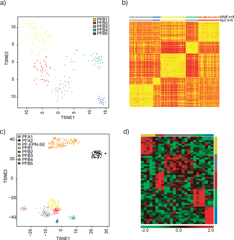
Figure 1:
Clustering of PFB reveals five distinct subtypes. A) t-SNE plot showing the relative distribution of the five subtypes. B) Heatmap obtained from spectral clustering (SpC) where by yellow represents more similar samples and red represents disparate ones. Color bars at the top indicate the t-SNE cluster at k=5 and the spectral clustering clusters (SpC) at k=5 C) t-SNE plot showing PFB clustered concomitantly with PF-SE and PFA. D) Heatmap representing the expression levels of the ten most differentially expressed genes per subtype. Each column represents one sample, and each lane represents one gene. Gene expression levels are represented by a color scale as indicated.

