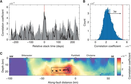
Fig. 3. Correlation results from the geodetic matched filter analysis for the NW Parkfield group.

(A) Positive part of the correlation functions for all the patches (gray curves). The black curve highlights the correlation function with the highest amplitude. The red dashed line indicates the zero relative stack time. (B) Histogram of the 10,000 maximums of correlation after stacking GPS windows using 20 random dates instead of the LFE burst dates. The red line indicates the amplitude of the observed correlation at the relative stack time zero in (A). The black arrowhead line indicates the 3σ of a Gaussian distribution fit. (C) Amplitude of the correlation at zero relative stack time for each dislocation patch on the fault. The highest correlation values are clustered around the black solid circles showing the location of the LFE families in the NW Parkfield group. The black rectangle and blue square are the SSE rupture areas used to estimate the Mw of the transient event.
