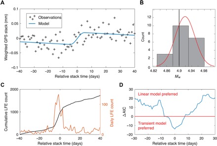
Fig. 4. Model of the average SSE.

(A) Weighted stack of the GPS postprocessed time series. The blue curve shows the best fitting model with a linear term plus a 10-day transient event centered on zero. (B) Histogram showing the Mw estimates from the jackknife test. The red line is a Gaussian fit of the histogram. The black line shows the Mw estimated with all the events and assuming the black rectangle shown in Fig. 3C as a rupture area. (C) Cumulative number of LFEs in black, averaged over the 20 bursts of LFEs. The orange curve represents the corresponding daily count of LFEs. (D) Difference of the AICs for models including transient events and linear models. The models are computed on 81-day sliding time windows with centered transient events. Negative values mean that the model with a transient is preferred for a given relative stack time.
