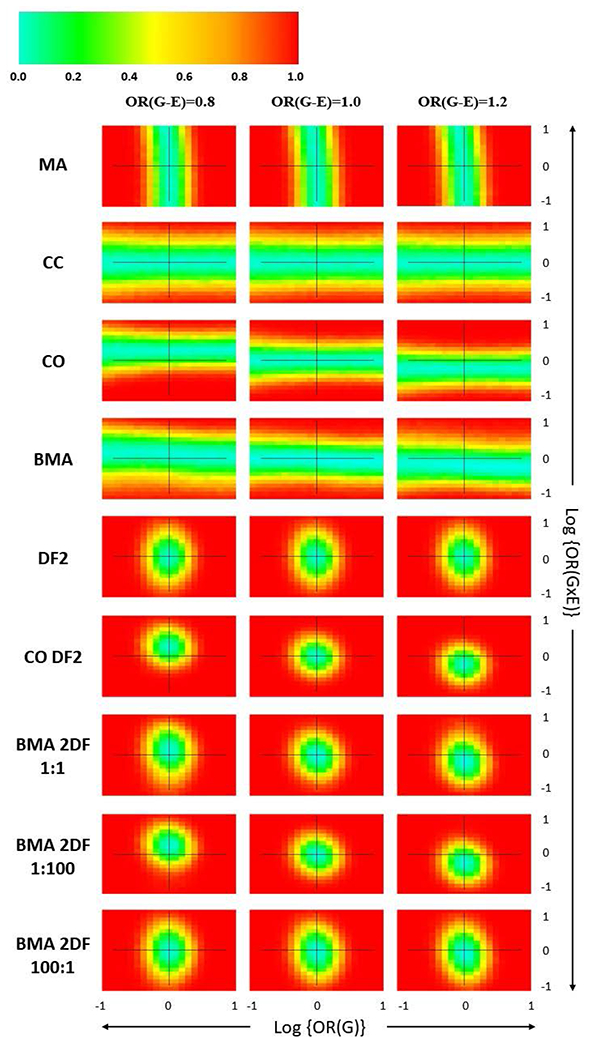
Figure 1.

Heatmaps depicting power patterns for detection of GxE interaction across a marginal G and GxE interaction effect range r = [−1.0, +1.0] for one-step methods on 1,000 simulations of 500 cases and 500 controls. Within each heatmap plot in the grid, the x-axis shows the simulated marginal G effect with the null indicated by a vertical line. The y-axis is the simulated GxE effect with the null indicated by a horizontal line. The grid columns of Figure 1 represent the simulated G-E association in the population.
