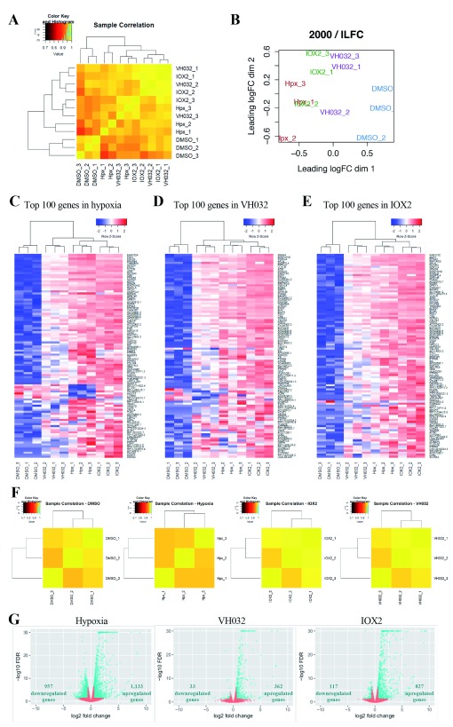
Figure 1. Differential gene expression analysis of RNA-seq results.
( A) Heatmap of Pearson correlations among RNA-seq samples that have been normalised to their total counts. ( B) Multidimensional scaling plot of RNA-seq data. The distance between two samples reflects the leading logFC of the corresponding samples. The leading logFC is the average (root mean square) of the 2000 largest absolute logFCs for genes between those two samples. ( C–E) Heatmaps of log2 counts per million (logcpm) across all the samples using the top 100 most differentially expressed (DE) genes in ( C) Hypoxia, ( D) VH032, and ( E) IOX2. The Pearson correlation was used to compute distances between genes and samples, and the clustering was performed using average linkage. Each column corresponds to a sample and each row corresponds to a specific gene. ( F) Heatmaps of Pearson correlations between replicates of the same conditions. Each data had been normalised to their total counts. ( G) Each dot represents a differentially expressed gene comparing the condition stated in the heading legend to DMSO vehicle control. Blue dots represent genes with increased expression (logFC > 0.58; to the right) or decreased expression (logFC < –0.58; to the left) at false discovery rate (FDR)<0.05. Blue triangles (present at –log10 FDR of 30) represent genes with logFC > 0.58 or < –0.58 and –log10 FDR > 30.

