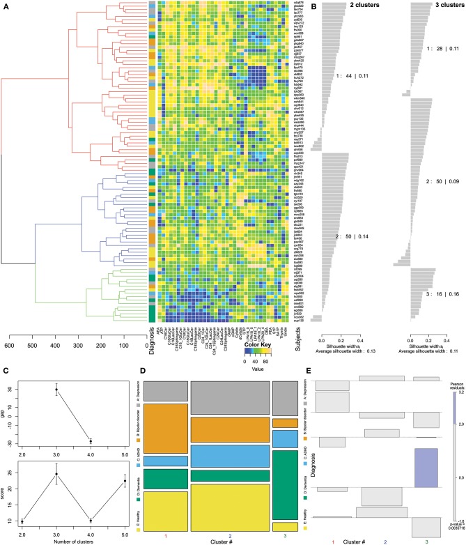
Figure 2.
Data structure found obtained by means of Ward clustering (24) of the data space of d = 35 plasma lipid mediator concentrations acquired in n = 94 subjects. (A) Cluster dendrogram showing three clusters, and matrix plot of the transformed and age corrected data rescaled to a range of [0,…,100] shown in the adjacent matrix plot displaying the transformed concentrations of d = 35 lipid mediators (columns) acquired from n = 94 subjects (rows) with color coding for the scaled data. (B) Silhouette plots (60) for 2 or 3 clusters, which indicate how near each sample is to its own relative to the neighboring clusters. Positive values indicate that the sample is away from the neighboring clusters while negative values indicate that those samples might have been assigned to the wrong cluster because they are closer to neighboring than to their own cluster. The low silhouette coefficients of 0.11 or 0.13, however, indicate a weak cluster structure. (C) The optimal cluster number was identified based on cluster stability criteria assessed using the progeny algorithm (27, 30). The optimal cluster number was chosen based on the two criteria: “greatest score” and “greatest gap” (C) top and bottom, respectively, which both indicated three clusters. The error bars indicate standard deviations calculated from 10 runs of the progeny algorithm. (D) Mosaic of the contingency table between diagnosis groups (ordinate) and clusters (abscissa). The size of the cells is proportional to the number of subjects included. (E) Association plot visualizing the residuals of an independence model for the diagnosis vs. clusters contingency table (61). Each cell of the contingency table is represented by a rectangle that has (signed) height proportional to the signed contribution to Pearson's χ for the cell and width proportional to the square root of expected counts corresponding to the cell. Hence, the area of each box is proportional to the difference in observed and expected frequencies. The rectangles in each row are positioned relative to a baseline indicating independence, i.e., if the observed frequency of a cell is greater than the expected one, the box rises above the baseline, and falls below otherwise. Each diagnosis (lines) is plotted vs. the Ward derived clusters (columns) as a result of a contingency table analysis, indicating the relative representations of each cluster in across the tree nodes. The Pearson residuals are colored according to a perceptually uniform Hue-Chroma-Luminance (HCL) given at the right margin of the association plot (62). The figure has been created using the R software package [version 3.4.4 for Linux; http://CRAN.R-project.org/; (13)]. Specifically, for drawing the silhouette plots, the R library “cluster” was used [https://cran.r-project.org/package=cluster; (63)] and, tree and association plots were drawn using the R package “vcd” [https://cran.r-project.org/package=vcd; (37)] including the “strucplot” framework (37) and residual-based shadings (36), and the results of progeny cluster number detection are the graphical output of the R library “progenyClust” [https://cran.r-project.org/package=progenyClust; (30)].

