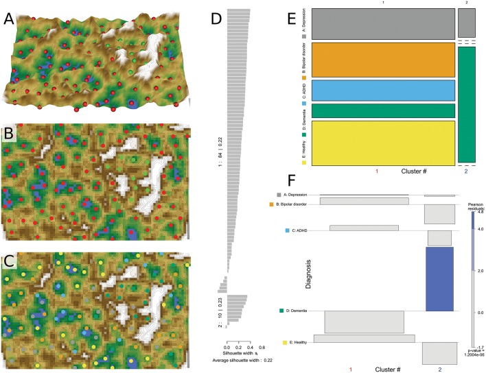
Figure 3.
Data structure found obtained by means of SOM based clustering of the data space of d = 35 plasma lipid mediator concentrations acquired in n = 94 subjects. (A) 3-dimensional display of the U-matrix visualization of distance based structures of the lipid mediator plasma concentration pattern (transformed and age corrected data rescaled to a range of [0,…,100]) observed in n = 94 subjects. The figure has been obtained using a projection of the data points onto a toroid grid of 4,000 neurons where opposite edges are connected. The dots indicate the so-called “best matching units” (BMUs) of the self-organizing map (SOM), which are those neurons whose weight vector is most like the input. A single neuron can be the BMU for more than one data point or subject, hence, the number of BMUs may not be equal to the number of acquired measurements. The U-Matrix was colored as a geographical map with brown (up to snow-covered) heights and green valleys with blue lakes. Valleys indicate clusters and watersheds indicate borderlines between different clusters. The BMUs are colored according to the two clusters identified on the basis. (B) Top view of the same U matrix, (C) Top view of the same matrix with BMUs color coded for the diagnosis groups. This indicates that the small cluster separated from the other data by a circular “mountain ridge” contained in particular patients with dementia. (D) Silhouette plot (60) for the 2 cluster solution. Positive values indicate that the sample is away from the neighboring clusters while negative values indicate that those samples might have been assigned to the wrong cluster because they are closer to neighboring than to their own cluster. The silhouette coefficient of 0.22 indicates better cluster sedation than observed with the Ward based clusters (Figure 2). (E) Mosaic of the contingency table between diagnosis groups (ordinate) and clusters (abscissa). The size of the cells as proportional to the number of subjects included. (F) Association plot visualizing the residuals of an independence model for the diagnosis vs. clusters contingency table (61). Each cell of the contingency table is represented by a rectangle that has (signed) height proportional to the signed contribution to Pearson's χ2 for the cell and width proportional to the square root of expected counts corresponding to the cell. Hence, the area of each box is proportional to the difference in observed and expected frequencies. The rectangles in each row are positioned relative to a baseline indicating independence, i.e., if the observed frequency of a cell is greater than the expected one, the box rises above the baseline, and falls below otherwise. Each diagnosis (lines) is plotted vs. the Ward derived clusters (columns) as a result of a contingency table analysis, indicating the relative representations of each cluster in across the tree nodes. The Pearson residuals are colored according to a perceptually uniform Hue-Chroma-Luminance (HCL) given at the right margin of the association plot (62). The figure has been created using the R software package [version 3.4.4 for Linux; http://CRAN.R-project.org/; (13)]. Specifically, the U matrix was drawn using our R package “Umatrix” [https://cran.r-project.org/package=Umatrix; (35)], for drawing the silhouette plots, the R library “cluster” was used [https://cran.r-project.org/package=cluster; (63)] and tree and association plots were drawn using the R package “vcd” [https://cran.r-project.org/package=vcd; (37)] including the “strucplot” framework (37) and residual-based shadings (36).

