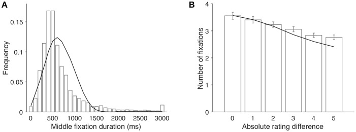
Figure 3.
(A) The histogram of middle fixation duration and the model fit. Bars and line represent the empirical distribution and the simulated distribution, respectively. The last bin contains all fixations longer than 3,000 ms. (B) average number of fixations per trial as a function of absolute rating difference. Bars represent the empirical data (error bars indicate 1 s.e.m. across participants); the line represents model simulation results.

