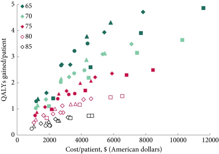
Figure 2.

The costs and QALYs gained per patient of all evaluated surveillance strategies. Both costs and QALYs are discounted. The colours of the symbols represent the ages at the start of the surveillance strategy and the symbols the different frequencies of surveillance (square every 3 months, diamond every 6 months, triangle every 12 months, and circle every 24 months).
