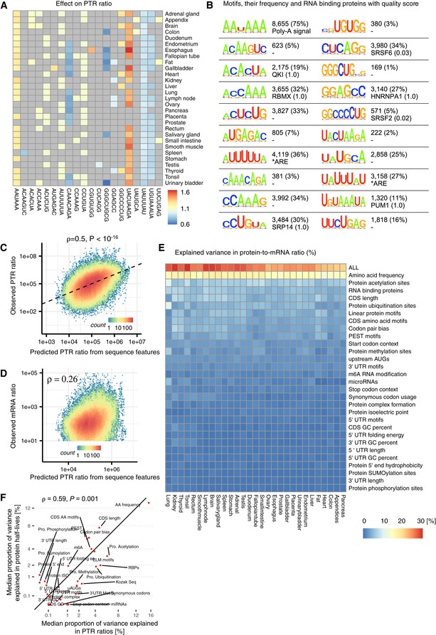
Figure 5. 3′ UTR results and model summary.

- Estimated effect of PTR ratio in each tissue (row) of the 20 3′ UTR k‐mers (column) associating with either median PTR ratio across tissues or tissue‐specific gene‐centered PTR ratios. Color scale ranges from blue (negative effect) to red (positive effect). Gray marks non‐significant (FDR ≥ 0.1) associations.
- First and third columns: motif information content logos for the 20 k‐mers of panel A, obtained by motif consensus sequence search in 11,575 5′ UTR sequences allowing for one mismatch (Materials and Methods). Second and fourth columns: number and percentage of transcripts consensus motif sequence among the 11,575 transcripts (first line) and best significantly matching RNA binding protein motif of the database ATtRACT (Giudice et al, 2016) together with the ATtRACT motif quality score Q (value between 0 and 1, the higher the better; Materials and Methods).
- Observed PTR ratios of all tissues (y‐axis) versus predicted PTR ratios by the interpretable sequence model (x‐axis) which includes 18 sequence feature groups representing 204 post‐transcriptional regulatory elements.
- Observed mRNA levels of all tissues (y‐axis) correlates with predicted PTR ratios by the interpretable sequence model (x‐axis) which includes 18 sequence feature groups representing 204 post‐transcriptional regulatory elements. This observation supports the hypothesis that genes that are highly transcribed are also optimized for post‐transcriptional regulation leading to higher protein levels.
- Proportion of variance in tissue‐specific PTR ratios explained (R 2) by separate linear models representing one sequence feature group in each tissue. The first row (labeled “ALL”) corresponds to the linear model combining all of the features displayed in the consecutive rows.
- Median proportion of variance in tissue‐specific PTR ratios explained (x‐axis, R 2) by each sequence feature group shown in (D) highly correlates with median proportion of variance explained in protein half‐lives of five different cell types (y‐axis). Most of the explained variance in PTR ratios is dominated by sequence elements that are highly predictive of protein half‐lives. The proportion of variance explained by each sequence feature group is shown in Fig EV5.
