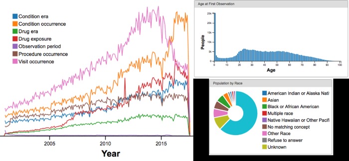
Fig 3. Achilles results on our “10% of Partners’ data” dataset.
From top left to bottom right: (a) data density (notice all are in the same magnitude); (b) age at first observation (notice the expected peak in 20s followed by decrease, with a spike at age 0 representing babies born in the hospital but not receiving follow-up care); (c) population distribution by race.

