Figure 6.

PSO-Enhanced thromboSeq for NSCLC Diagnostics
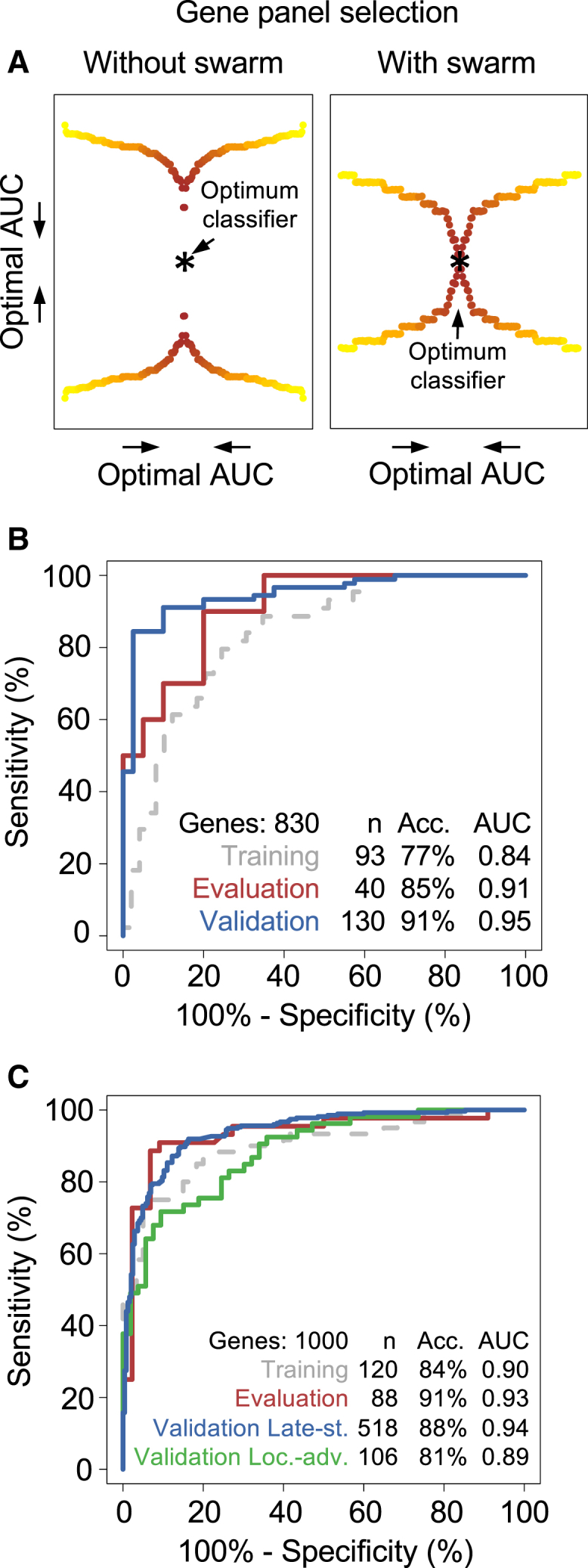
(A) Schematic representation of the particle-swarm optimization (PSO) approach. Yellow-to-red colored dots represent AUC values of a cohort classified using a thromboSeq classification algorithm, with use of 100 randomly compiled biomarker gene panels (left) or 100 biomarker gene panels proposed by swarm intelligence (right). Dots were mirrored twice for visualization purposes. Most optimal AUC value reached by PSO-enhanced thromboSeq is indicated in both plots with an asterisk.
(B) ROC analysis of PSO-enhanced thromboSeq classifications using only the matched non-cancer and NSCLC cohorts. Gray dashed line indicates ROC evaluation of the training cohort assessed by LOOCV, red line indicates ROC evaluation of the evaluation cohort (n = 40), blue line indicates ROC evaluation of the validation cohort (n = 130). Indicated are cohort size, most optimal accuracy, and AUC value.
(C) ROC analysis of PSO-enhanced thromboSeq classifications using matched training and evaluation of non-cancer and NSCLC cohorts and validation in the remaining matched and unmatched samples. Gray dashed line indicates ROC evaluation of the training cohort assessed by LOOCV, red line indicates ROC evaluation of the evaluation cohort (n = 88). ROC evaluation of the late-stage NSCLC (Validation Late-st.; n = 518) and locally advanced NSCLC (Validation Loc.-adv.; n = 106) is plotted in the blue and green lines, respectively. Indicated are cohort size, most optimal accuracy, and AUC value. Acc., accuracy.
See also Figures S3 and S4.
