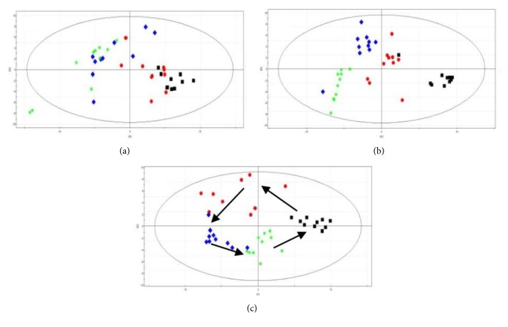
Figure 9.
Score plot from PCA derived from the GC/MS profiles of urine samples obtained from (a) control group, (b) model group, and (c) QHD group. The plot shows the trajectories of metabolite patterns at different time points. Black square: 0 weeks before modeling, red circle: 4 weeks before QHD administration, blue diamond: 6 weeks during QHD administration, and green asterisk: 8 weeks after QHD administration.

