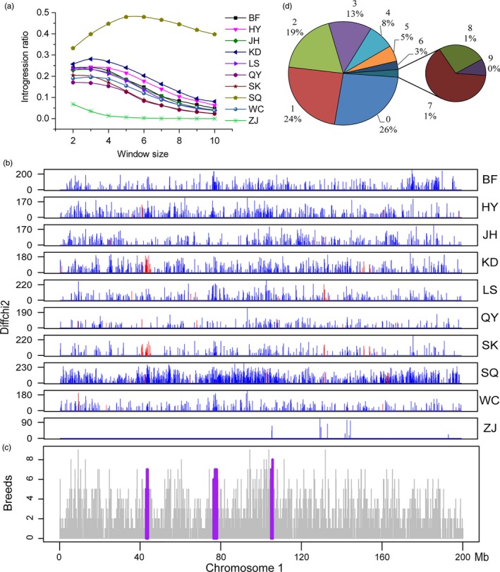
Figure 3.

Candidate loci of introgression and positive selection. (a) The statistic of introgression in varying window size for CICs. (b) Physical map and extent of introgression/positive selection on chromosome 1. Each box represents a CIC. The label on the right is the same as the abbreviation in Table 1, and the y‐coordinate is Δχ2. The location of introgression is marked with a blue vertical line, and introgression under positive selection is marked with a red vertical line. (c) Introgression frequency in CICs on chromosome 1. Purple regions indicate three long‐range introgression loci which are shared among multiple populations. The first region overlaps with the region under positive selection specifically in KD. (d) Summary of introgression sharing between populations. The number around the pie chart is the population number of introgression sharing and the corresponding ratio
