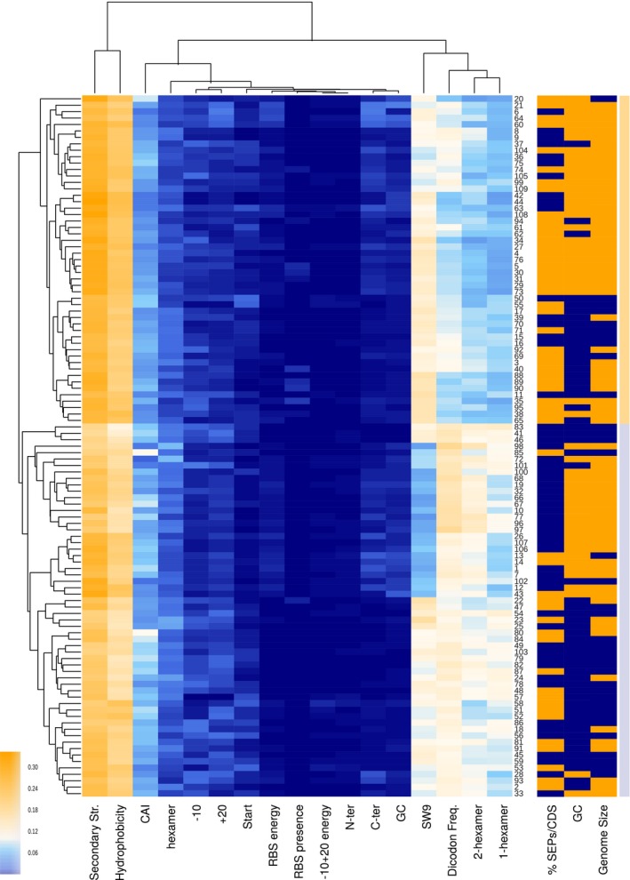
Figure 4. A comparison of the feature weights used for the prediction of SEPs in 109 bacterial genomes.

Clustered heat map using nearest point algorithm and representing the weights of different features in 109 bacterial genomes, and the clustering relations between features (top dendrogram) and species (side dendrogram). Rightmost light‐orange and light‐blue bars are included to differentiate the two main clusters. Numbers in the right vertical axis are short references representing the names of the bacterial genomes (Dataset EV15). The right three columns represent biological features not used in the classification. The ratio of the percentage of SEPs compared to the median value is colored as blue and orange for ≤ 13.16% of SEPs and > 13.16%, respectively. Blue and orange colors in the %GC column represent genomes with ≤ 38 and > 38% GC content (median value = 38), respectively. Genome size column separates species into small‐genome bacteria (≤ 1.5 Mb, blue) and large‐genome bacteria (> 1.5 Mb, orange).
