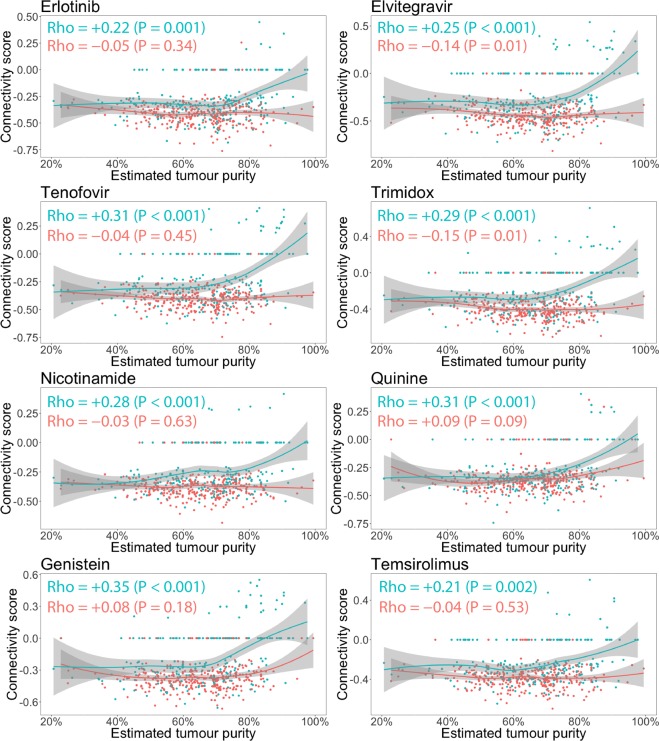
Figure 4.
Same data, statistical tests and plots as Fig. 2, but now the samples have been colored according to the probability of HIF-activation. The red points correspond to the 307 samples in the “More likely” group, whereas the green points correspond to the 214 samples in the “Less likely” group. For samples with the higher probability of HIF-activation (red), the connectivity scores do not show a trend towards neutral with increasing tumour purity and even show the reverse trend for elvitegravir and trimidox. For samples with lower probability of HIF-activation, the trend of connectivity scores being neutralized with increasing estimated tumour purity is instead intensified.

