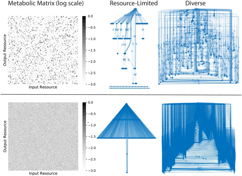
Fig 3. Energy flux networks differ in the two regimes.
Community-scale energy flux networks are plotted for a characteristic example from the diverse and resource limited regimes and two different choices of metabolic matrix Dαβ. The color of each pixel in the heat maps indicates the logarithm (base 10) of the corresponding matrix entry. In the networks, each node represents one of the M = 100 resource types. Edges represent steady-state energy flux from one resource type into another, mediated by consumer metabolism and leakage/secretion. The thickness of each edge is proportional to the flux magnitude, and edges with magnitudes less than 1% of the maximum flux are not displayed. The single node at the top of each graph is the externally supplied resource, and the rows of nodes at the bottom are resources that are not connected to the external supply by any flux above the 1% threshold. A topological analysis of the flux networks of all the simulated communities can be found in S10 Fig.

