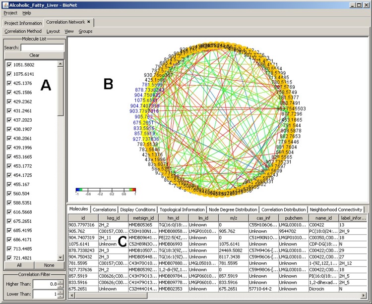
Fig 2. Correlation analysis window with single circle layout.
(A) Molecular IDs. (B) Interactive graphic display of molecular correlations in a single circle display while applying the Pearson correlation calculation. (C) Information panel display for rich set of information about the selected (highlighted) molecules in the graph. Color scheme is used to show the correlation directions: red indicates positive correlation while blue indicates negative correlation. The encircled color areas readily demonstrate clusters of strong molecular correlation.

