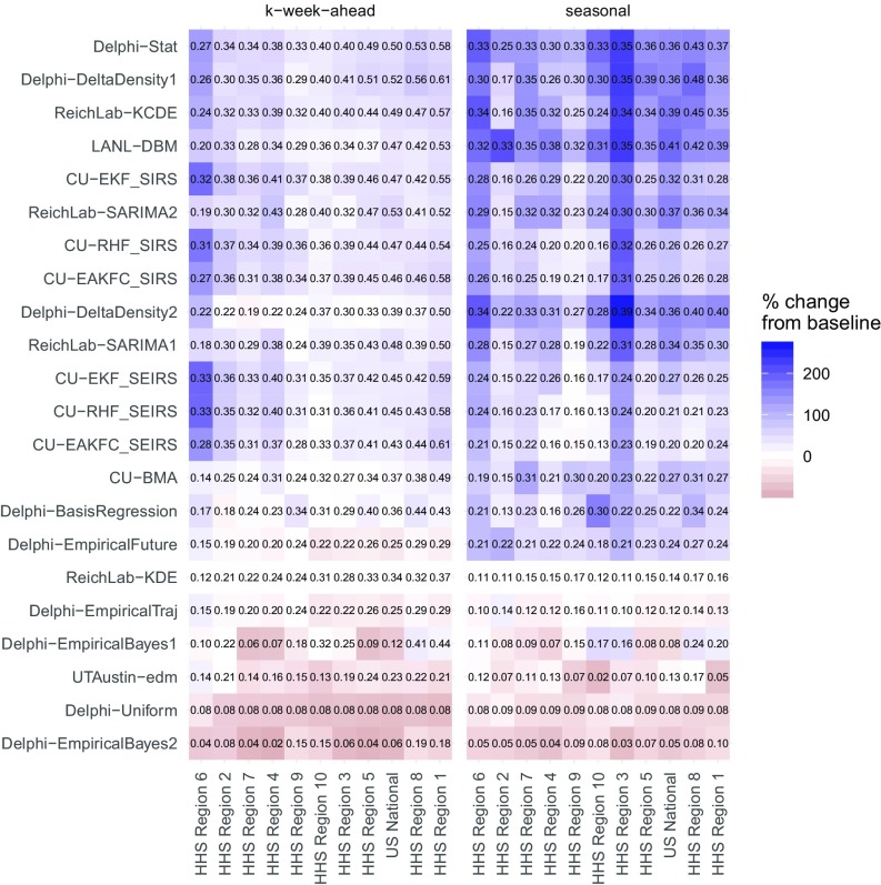
Fig. 2.
Average forecast score by model region and target type, averaged over weeks and seasons. The text within the grid shows the score itself. The white midpoint of the color scale is set to be the target- and region-specific average of the historical baseline model, ReichLab-KDE, with darker blue colors representing models that have better scores than the baseline and darker red scores representing models that have worse scores than the baseline. The models are sorted in descending order from most accurate (top) to least accurate (bottom) and regions are sorted from high scores (right) to low scores (left).

