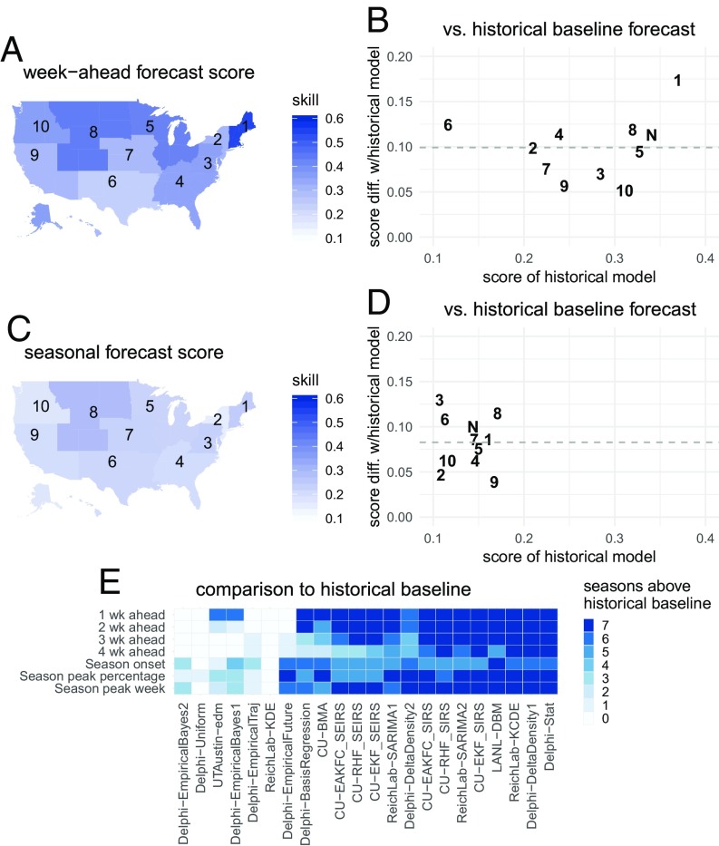
Fig. 3.
Absolute and relative forecast performance for week-ahead (A and B) and seasonal (C and D) targets, summarized across all models that on average performed better than the historical baseline. A and C show maps of the United States that illustrate spatial patterns of average forecast accuracy for week-ahead (A) and seasonal (C) targets. Color shading indicates average forecast score for this model subset. B and D compare historical baseline model score (x axis) with the average score (y axis, horizontal dashed line at average across regions) with one point for each region. For example, a y value of 0.1 indicates that the models on average assigned 10% more probability to the eventually observed value than the historical baseline model. The digits in the plot refer to the corresponding HHS region number, with N indicating the US national region. E shows the number of seasons each model had average performance above the historical baseline.

