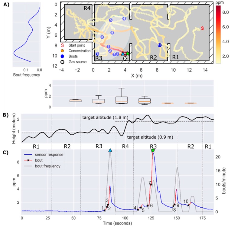
Figure 20.
Results of Experiment 3. (A) 2D map of the instantaneous concentration (ppm), with bouts represented by blue circles ( ppm/s). A hand-drawn ellipse outlines the approximate plume shape based on the location of bouts. The average bout frequency along the y-axis is shown in the leftmost panel. The box plot below the map represents the instantaneous concentration along the x-axis; (B) Drone trajectory in the z-axis. (C) Temporal evolution of the instantaneous concentration (ppm), with detected bouts highlighted in red (the black star indicates the start of the bout). The bout frequency (gray line) is computed using a sliding window of 5 s. The identifiers R1–R4 between panels (B) and (C) indicate the area of the map in which the drone is flying at each moment. The maximum of the instantaneous concentration and the bout frequency are indicated by a green star and a blue triangle, respectively.

