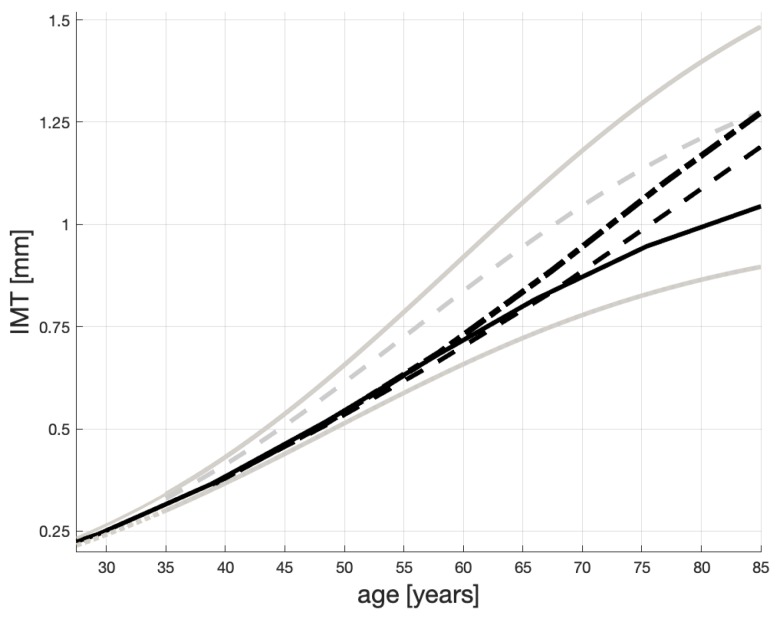
Figure 5.
How IMT can evolve given hsCRP age profiles in Figure 3. The gray lines are copied from Figure 1, where the dashed line represents atherosclerosis non-sufferers; the solid line—not healthy but not necessarily “heavy” sufferers; the solid line—“heavy” sufferers. Each evolution is a result of an hsCRP scenario (Figure 3) and, then, of the corresponding progression of the maximum IMT level (Figure 4).

