4.

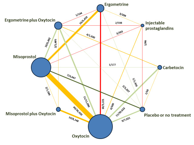
Network Diagram for PPH ≥ 500 mL. The nodes represent an intervention and their size is proportional to the number of trials comparing this intervention to any other in the network. The lines connecting each pair of interventions represent a direct comparison and are drawn proportional to the number of trials making each direct comparison. Numbers on the lines represent the number of trials and participants for each comparison. The colour of the line is green for high‐certainty evidence; light green for moderate‐certainty evidence; orange for low‐certainty evidence and red for very low‐certainty evidence. Multi‐arm trials contribute to more than one comparison.
