. 2019 Feb 26;8:e40162. doi: 10.7554/eLife.40162

Figure 5. MOSES generates motion signatures to produce a 2D motion map for unbiased characterisation of cellular motion phenotypes.

In all panels, each point represents a video (see legends for colour code). The position of each video on the 2D plot is based on the normalised mesh strain curves, analysed by PCA. (A) The mapping process for a single video. (B) The 5% serum videos (n = 77) were used to set the PCA that maps a strain curve to a point in the 2D motion map. (C) The 0% serum videos (n = 48) were plotted onto the same map defined by the 5% serum videos using the learnt PCA. In (B) and (C), the mean mesh strain curves for each cell combination are shown in the insets. Light blue region marks the two standard deviations with respect to the mean curve (solid black line). (D) Same map as in (C) with points coloured according to 0% or 5% serum. (E) The normalised mean strain curves for 0–20 ng/ml EGF addition to EPC2:CP-A from Figure 4E plotted onto the same map defined by the 5% serum videos.

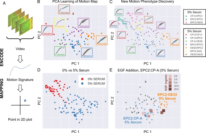
Figure 5.

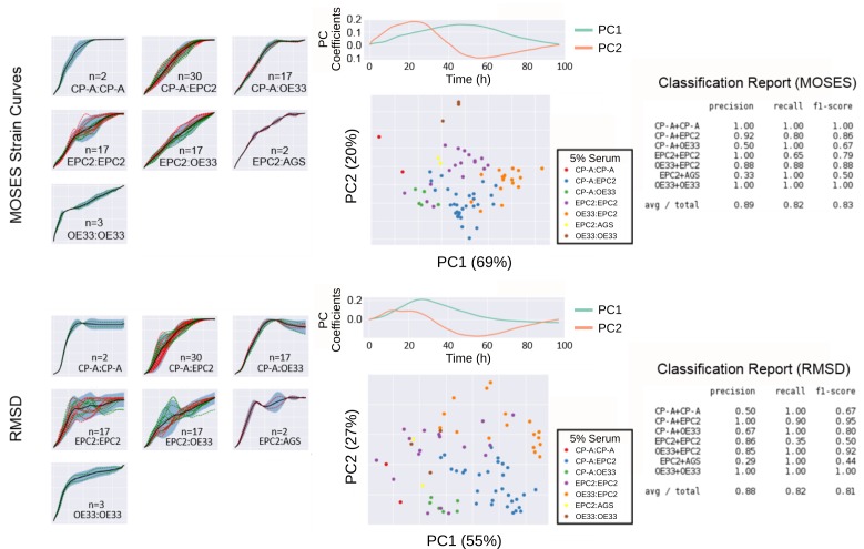
Figure 5—figure supplement 1. Comparison of MOSES-normalised strain curves vs RMSD curves as motion signatures for motion map generation from 5% serum videos.

Figure 5—figure supplement 1.

Left: Normalised strain curves for each video organised by cell line combination with MOSES (top) and RMSD (bottom). Each video is represented by a single dashed curve coloured according to the dye colour used for the first cell line in the combination indicated on each plot. Thus for combinations such as CP-A:CP-A where the green dyed CP-A is always the left sheet, there is only one green dashed line. Solid black line is the mean curve, blue shaded region marks ± two standard deviations of the mean curve, total n = 77 videos. Middle: PCA analysis applied to MOSES (top) and RMSD (bottom) shown with the respective derived principal components plotted above the PCA motion map. Percentage of variance explained by each principal component or PC is displayed in brackets. Each point is a video (see legends for colour code). Right: Classification report with the precision, recall and f1 score after fitting a balanced linear SVM (support vector machine) machine learning classifier trained on the normalised MOSES strain or RMSD curves of all the videos, n = 77. AGS cells are derived from gastric adenocarcinoma. In all plots, EPC2:AGS is included as another columnar cell and cancer control for comparison.
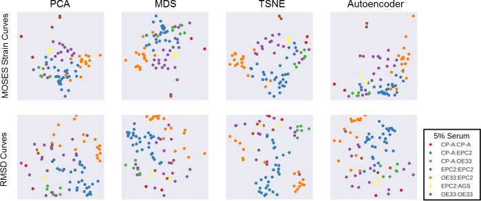
Figure 5—figure supplement 2. Comparison of motion map learning using different dimensional reduction techniques with MOSES strain curves and RMSD curves. .

Figure 5—figure supplement 2.

In each panel, the same 77 serum videos were used. From left to right, PCA - principal components analysis, MDS - multidimensional scaling, TSNE - t-distributed stochastic neighbour embedding and a neural network autoencoder. See Material and methods for details. Each point represents a video, as indicated in the legend. In all plots, EPC2:AGS is included as another columnar cell and cancer control for comparison.