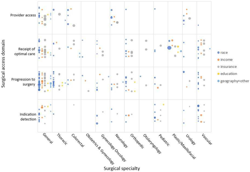
Fig 4.
Evidence map of measures of surgical access disparities in the US. *Bubble size indicates number of studies supporting each measure. Plotting of the bubbles in each cell is systematic to increase readability of the figure. Horizontally, the bubbles are in five rows based on the disparity domain (color). A random placement generator was used to distribute bubbles vertically inside each cell.

