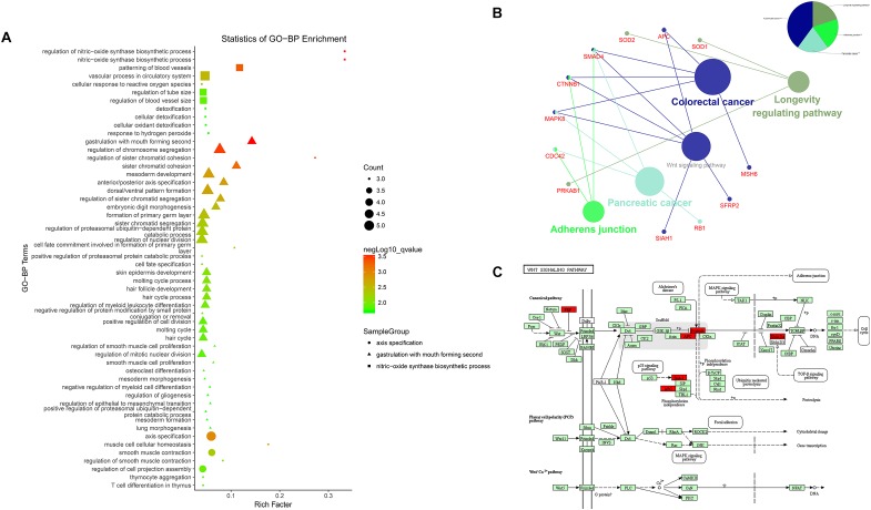
FIGURE 4.
Enrichment analysis of differentially expressed mRNAs. (A) Advanced bubble chart of GO-BP. Y-axis label represents terms name, and X-axis label typifies rich factor which is defined as the percentage of target genes per term. Size and color of the bubble are measured as count and –log10qvalue to represent the amount of differentially expressed mRNAs enriched in these terms and the enrichment significance, respectively, as well as three shapes of SampleGroup represent three functional clusters. (B) KEGG interaction network. Terms are represented as nodes based on the kappa score level (= 0.4), and node size indicates the term enrichment significant. Edges represent shared genes, the wider the edge, the larger the overlap is. The colors indicating different functional groups are shown at the right top. (C) Bos taurus Wnt signaling pathway map (Kanehisa et al., 2017). Upregulated genes in our network are marked in red.

