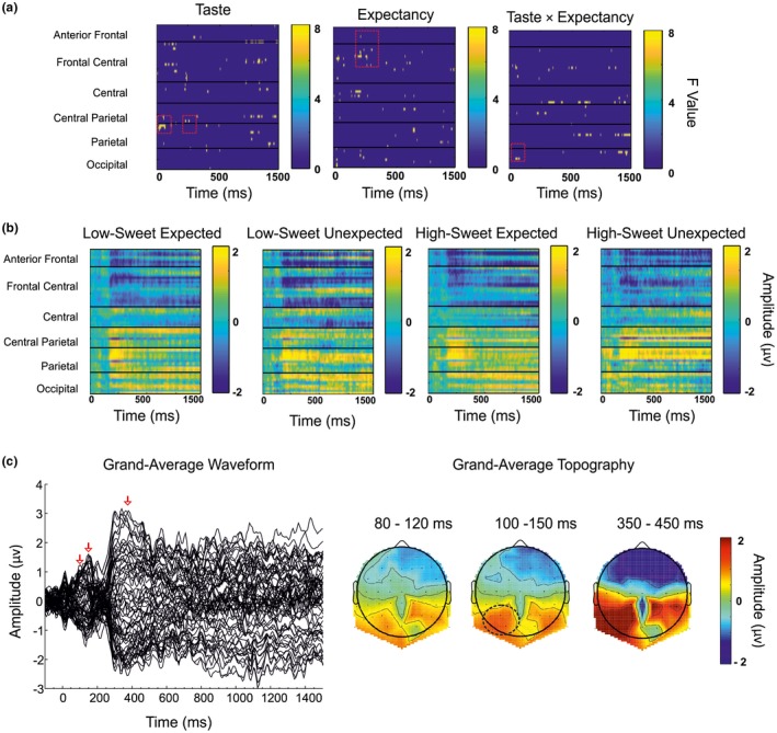
Figure 2.

(a) Heat map plots of F values for each independent variable with electrodes arranged left to right, front to back. Each line represents an electrode, with bar charts representing F value. (b) Heat map plots of amplitude (μV) for each condition. Each line represents an electrode, with bar charts representing amplitude (μV). (c) Butterfly plot of grand‐averaged waveforms at all electrode sites. (d) Scalp topographies of mean amplitude over the 80–100 ms, 100–150 ms, and 350–450 ms epochs
