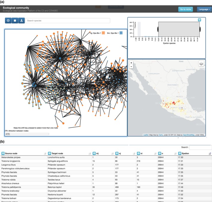
Figure 2.

Different views of the spatial correlation results. (a) histogram (top right), inferred network (left), heat map that shows which areas have more of the selected species (bottom right). (b) A table displays the quantities associated with each correlation (network link)
