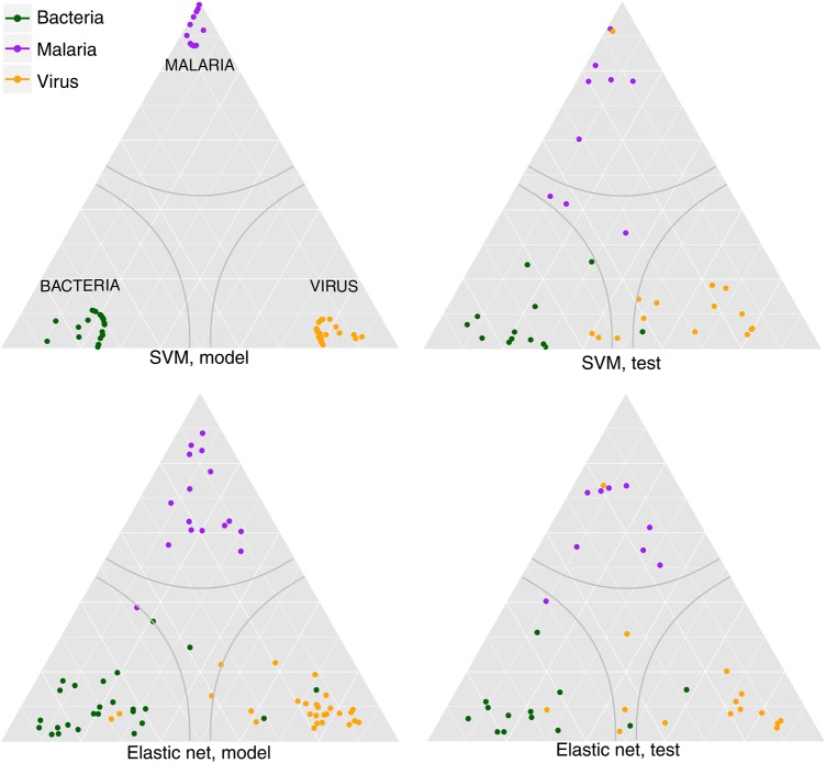
Figure 3.
Predicted probability ternary plot. The predicted probability of each classification is projected onto a triangle. Each corner represents a category having probability 1. There are 3 classes, and the probabilities for each class must sum to 1, hence there are only 2 degrees of freedom. The probability of a class at a given point is proportional to the distance along a line extending from the vertex to its opposing side. Grid lines represent constant weight for a class. For instance, the purely horizontal lines are lines of constant probability of malaria. Gray lines represent our confidence boundary; anything within that region has brier score <0.3 and is not called. Plots were generated using ggtern [41]. Abbreviation: SVM, support vector machine.

