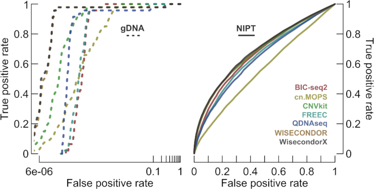
Figure 5.

The performance capabilities of normalization techniques. The gDNA plot (left) represents the performance on all gDNA cases, the NIPT plot (right) on the remaining NIPTs. The false positive rate for gDNA is shown in log-scale. These ROC curves do not represent the true performance of the tools, yet they do indicate the most important aspect: normalization. We can thus conclude that, for both gDNA and NIPT, WISECONDOR performs best. Note that the WisecondorX curves are highly similar to the ones from WISECONDOR, as very few modifications to the actual normalization algorithm have been made.
