Figure 1.
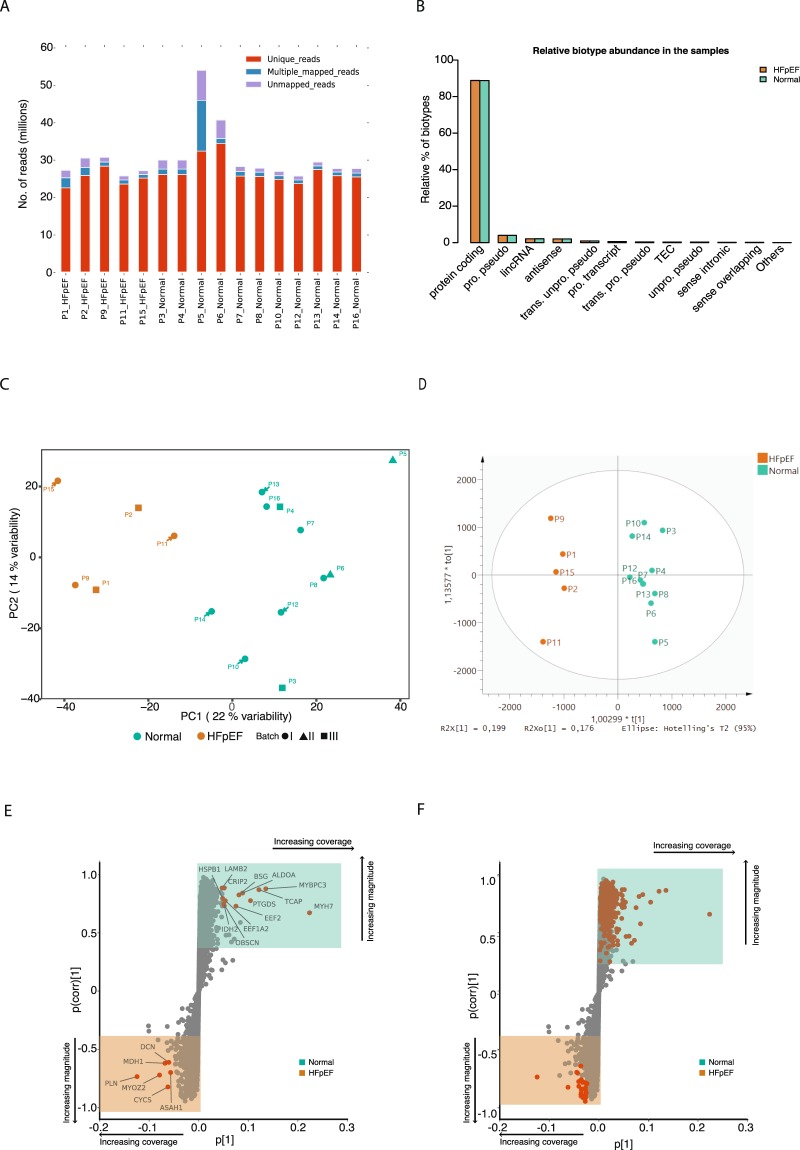
Gene expression profiles of left ventricle tissues discriminate HFpEF proxy from Normal physiology. (A) Stack barplot showing uniquely mapped, multiple mapped and unmapped reads. The x axis shows the samples and the y axis the number of reads. (B) Bar plot showing the relative abundance of each biotype (y axis) in the samples (x axis). (C) Principal component analysis (PCA) score plot with the two principal components (PC1 and PC2) plotted on the x- and y-axis, respectively. Each data point represents one sample, which is colour-coded according to the condition and shaped according to the sequencing batch. Green and orange colours correspond to Normal physiology and HFpEF proxy, respectively. (D) Orthogonal projections to latent structures discriminant analysis (OPLS-DA) score plot for the groups HFpEF proxy (orange) and Normal physiology (green). (E) S-plot of the OPLS-DA data showing the magnitude of each gene’s contribution to the separation, p[1], in relationship to its significance, p(corr)[1]. Genes contributing to the highest magnitude of the separation for the respective groups are highlighted in red/orange. Shaded boxes indicate up-regulated genes in the HFpEF proxy group (bottom orange box) and in the Normal physiology group (top green box). (F) The same plot as in “E” but genes overlapping with differentially expressed genes are highlighted with in red/orange.

