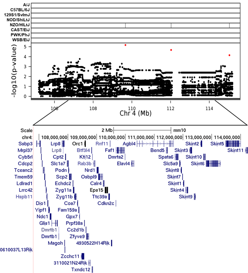
Fig. 3.

Association mapping of TestWt4 QTL. High resolution view of QTL support interval. Top panel shows SNP marker associations of the eight DO founders. The x-axis displays the distribution along the chromosome in physical distance. The y-axis displays the –log10(p-value) for the SNP mapping. Each data point shows the –log10(p-value) at one SNP; red data points indicate scores above the p < 0.1 threshold. Below each plot is an expanded view showing known genes within the QTL support interval. Gene data retrieved from the UCSC Genome Browser (https://genome.ucsc.edu)
Graphics programs: R and Microsoft PowerPoint were used to create figure 3
