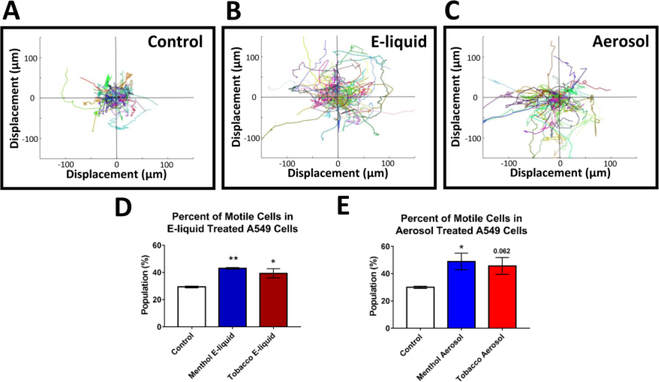
Figure 4: Increased Motility after EC Treatment.
(A-C) Motility graphs show compilation of trajectories and distance traveled by individual control cells and treated cells (central circles are positioned 25μm from the starting location). Different colors correlate with different cells tracks. (D-E) The percent of “motile cells” (displacement > 25um) increased in treated groups. Each error bar is the mean ± SEM of four independent experiments. Motility data statistical analysis were done using a one-way ANOVA with Dunnett’s post hoc test; treated groups were compared to the control. Asterisks on top of each bar indicate the statistical significance. (* = p <0.05. ** = p <0.01.)

