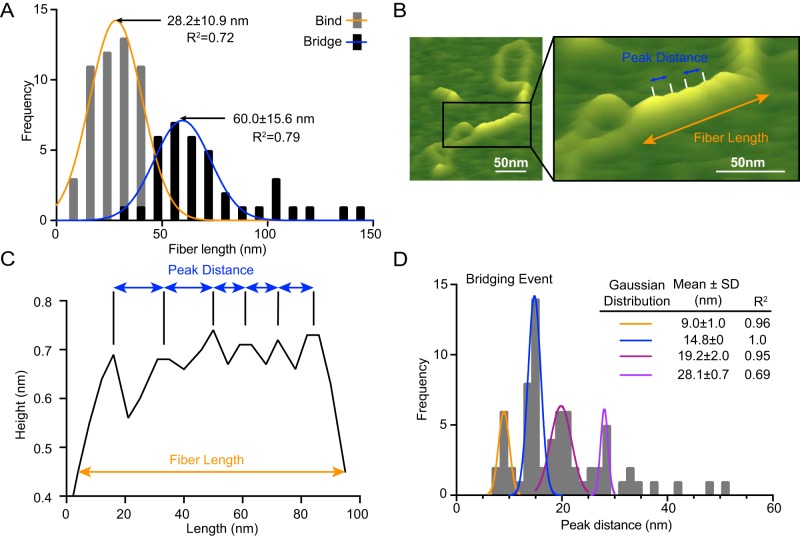
Figure 2.
Analysis of Ctp1–DNA interactions by AFM. A, frequency distribution of fiber lengths from both bridging and binding events. Data are represented as mean ± S.D. calculated from nonlinear Gaussian fit. n = 37 bridging events and 53 binding events. B, representative illustration highlighting measurements analyzed in AFM images. The AFM image is the same as in Fig. 1B but is enlarged and labeled to illustrate how fiber length and peak distance metrics were assessed for calculations documented in A and C. Black box, enlarged region. C, representative section trace from our custom analysis software ImageMetrics, illustrating peak distance and fiber length measurements. D, frequency distribution of peak distances in bridging events. Data are represented as mean ± S.D. calculated from nonlinear Gaussian fit. n = 37 bridging events.

