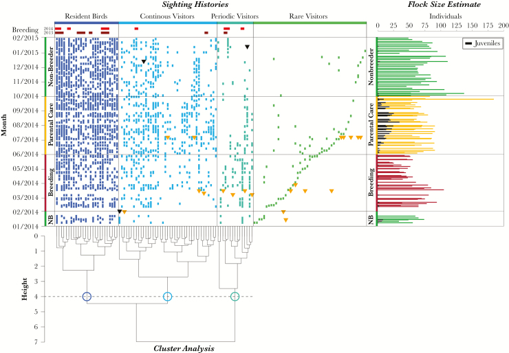
Figure 2.
Sighting histories of marked birds in the zoo. The 3 categories determined by the cluster analysis are shown in different colors. The order of the individuals corresponds to the leaves of the dendrogram for the cluster analysis. Rare visitors were not included in the cluster analysis and are ordered in this plot by order of first sighting. The individuals with available breeding related data are denoted at the top of the graph (dark red = 2013, bright red = 2014). Inverted triangles indicate when birds either died (black) or were newly ringed (orange). The flock size estimates per day of observation are shown in the right graph. The colors correspond to the different seasons. This graph also shows the proportion of juvenile birds in the study area designated in black.

