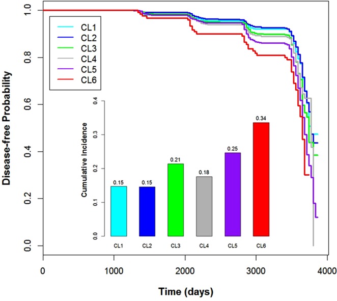
Figure 2.

Result of Survival Analysis Using Follow-up of the Discovery Data. A Kaplan–Meier survival curve was fitted based on the disease-free interval from the baseline investigation to the diagnosis of type 2 diabetes or the end of the follow-up. Because the follow-up dates were recoded monthly, we used the first day of the month as follow-up date. The fitted curves of the clusters are located according to the prevalence of the clusters in the discovery data in general, whereas the curve of CL1 (n = 1808) is under that of CL2 (n = 2937). The bar plot located under the curves indicates the cumulative incidence rates of type 2 diabetes during the follow-up. The cumulative incidence rate for each cluster was estimated as the number of new cases of each cluster during follow-up. As in the discovery data, there was a clear tendency for the cluster-specific incidence rate of type 2 diabetes to correlate with the initial cluster-specific prevalence in general, but the incidence rate of CL3 (n = 690) was much higher than that of CL1, CL2, and CL4 (n = 807). This was not the case for the prevalence rates in the discovery data. The n indicates the initial number of participants in each cluster. The n of CL5 and CL6 is 2050 and 156, respectively. The sharp decrease in survival curves after 3,000 days of follow-up arises from the small number of remaining participants. See Supplementary Results for a detailed explanation.
