
Figure 2.
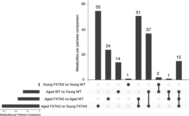
Altered metabolites by pairwise comparison. An UpSet plot was generated in R to visualize the metabolites altered in each comparison (53). The horizontal bars indicate the total number of metabolites per pairwise comparison. The vertical bars indicate the number of metabolites in each combination of pairwise comparisons.