. 2019 Mar 5;8:e40538. doi: 10.7554/eLife.40538

Figure 4. CILP approach reveals hundreds of correlation QTLs.

(a) Example of a correlation QTL, where the SNP rs10953329 controls the magnitude of the correlation between the mRNA expression levels of POC1B and RIOK3. (b) Gene pairs involved in significant (FDR < 10%) correlation QTL. Each black segment represents a gene, and each line connecting two segments represents a significant correlation QTL. Lines are colored by the identity of the SNP controlling the magnitude of the correlation between the gene pair. (c) Many correlation QTL identified in the NESDA discovery set (n = 2477) replicate in a second set of NESDA participants (n = 1337). Plot shows effect sizes for each correlation QTL, estimated in the discovery or replication cohort (effect sizes are derived from in matrixEQTL (Shabalin, 2012)). Points are colored to indicate whether a given correlation QTL passed Bonferroni correction in the replication dataset.

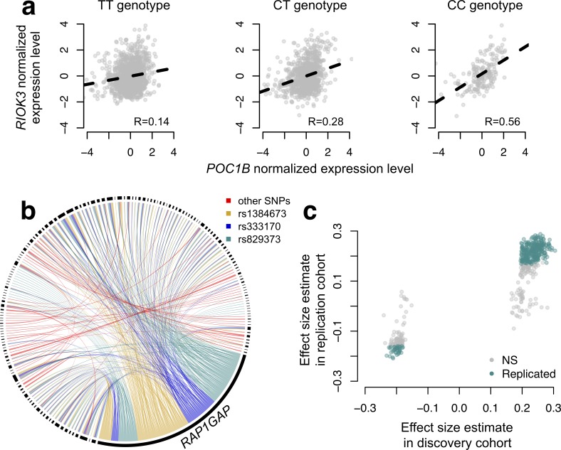
Figure 4.

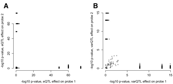
Figure 4—figure supplement 1. (A) Mean and (B) variance effects of SNPs identified as significant correlation QTL.

Figure 4—figure supplement 1.

For each SNP that significantly affected the correlation between a pair of gene expression probes (n = 484 correlation QTL), we asked whether the SNP also affected the mean or variance of the expression levels of each probe. The 3 SNPs that show strong effects on the mean and variance of one co-expressed probe but not the other are all in cis with RAP1GAP (and affect the mean and variance of this gene; see also Figure 4—figure supplement 2).
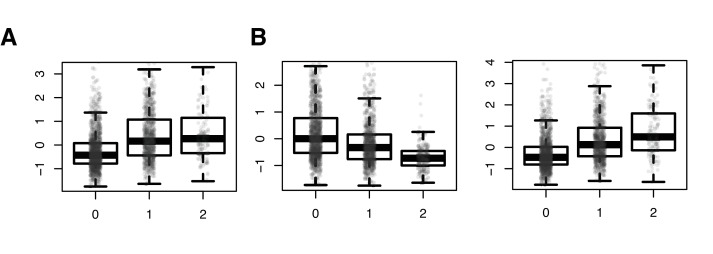
Figure 4—figure supplement 2. SNPs driving correlation QTL (between RAP1GAP and other many other genes) are also strong cis eQTL for RAP1GAP.

Figure 4—figure supplement 2.

Results from a linear model predicting normalized RAP1GAP gene expression in the NESDA dataset as a function of SNP genotype, controlling for sex, age, smoking behavior, major depressive disorder, red blood cell counts, year of sample collection, study phase, and the first five principal components from a PCA on the filtered genotype call set: (A) rs829373: beta = 0.541, p<10−16; (B) rs333170: beta = −0.447, p<10−16; (C) rs1384673: beta = 0.591, p<10−16.
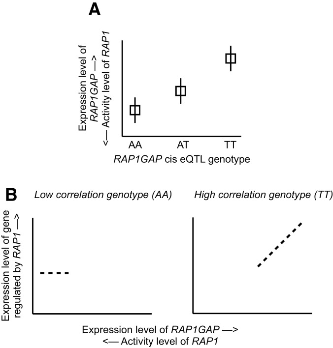
Figure 4—figure supplement 3. Mechanistic relationship between RAP1GAP eQTL and correlation QTL.

Figure 4—figure supplement 3.

(A) Several SNPs driving correlation QTL between RAP1GAP and genes regulated by RAP1 are also strong eQTL for RAP1GAP (specifically, rs829373, rs333170, rs333170). The primary function of RAP1GAP is to convert the transcription factor RAP1 – a master regulator of T and B-cell activation, cell adhesion, and neuronal differentiation – from its active GTP-bound form to its inactive GDP-bound form. Thus, through strong eQTL near RAP1GAP, individuals are biased toward high RAP1GAP mRNA expression and low RAP1 activity (the TT genotype in this example) or toward low RAP1GAP mRNA expression and high RAP1 activity (the AA genotype in this example). In other words, within a given individual, RAP1 exists in its constitutively active or inactive form depending on the genetic variation the individual harbors near RAP1GAP. (B) Intra-genotypic variation in RAP1 activity levels is only meaningful for the low activity genotype (the TT genotype in this example). In contrast, for individuals with the high activity genotype (AA in this example), the targets of RAP1 are constitutively repressed in all individuals, and dialing up or dialing down RAP1 activity levels has little effect. Together, this pattern produces correlation QTL involving SNPs that are also strong cis eQTL for RAP1GAP.
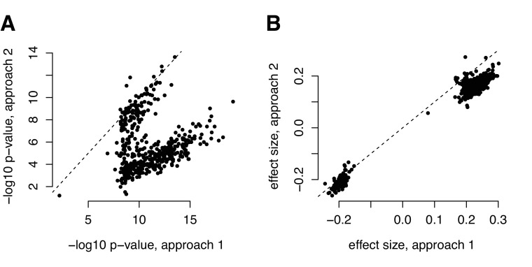
Figure 4—figure supplement 4. Comparison of (A) p-values and (B) effect size estimates from different approaches for identifying correlation QTL.

Figure 4—figure supplement 4.

Our metabolite analyses focused on data that were z-score normalized within each health status group (metabolic syndrome versus healthy). The parallel of this approach for mapping correlation QTLs would be to z-score normalize each transcript within each genotypic class before computing the product between two focal transcripts (y-axis, labeled ‘approach 2’); however, this pipeline is infeasible for efficient genome-wide QTL mapping, as it would require us to recalculate the outcome variable for every association test we performed. For the correlation QTL analyses presented in the main text, we therefore normalized, mean centered, and scaled each transcript before any product calculation (x-axis, labeled ‘approach 1’). This approach is different than normalizing each transcript within each genotypic class, but attempts to circumvent the same set of potential issues and has the advantage of only needing to be performed once (making it much more computationally feasible for genome-wide screens). For comparison, we present the effects size estimates and p-values from the two approaches for the set of 484 significant correlation QTL we identified with approach 1.
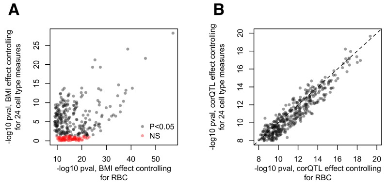
Figure 4—figure supplement 5. Cell type effects on (A) BMI-gene expression correlations and (B) estimations of the correlation QTL effect.

Figure 4—figure supplement 5.

(A) Comparison of the -log10 p-values for the effect of BMI estimated using the pipeline presented in the main text (x-axis) versus a parallel analysis where 24 measures of cell type heterogeneity are included as covariates (y-axis). The pipeline presented in the main text included red blood cell counts as a covariate, but no other measures of cell type heterogeneity. The alternative pipeline includes this measure as well as 23 additional measures inferred through PCA or deconvolution (Newman et al., 2015; Preininger et al., 2013). (B) Comparison of the -log10 p-values for the correlation QTL effect, obtained from the pipeline described in the main text (x-axis) versus a pipeline that regressed out 24 measures of cell type heterogeneity from the gene expression data before correlation QTL testing (Pearson correlation, cor = 0.937, p<10−16).
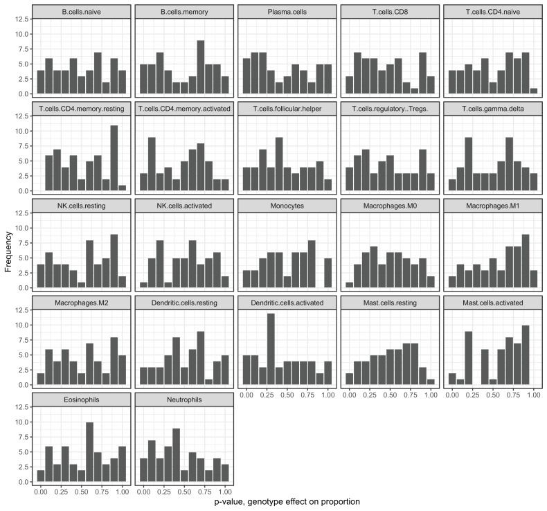
Figure 4—figure supplement 6. Genotypes at correlation QTLs do not predict cell type heterogeneity.

Figure 4—figure supplement 6.

Each plot represents the p-value distribution obtained from testing whether genotype at each unique correlation QTL SNP influences cell type proportion estimates. Results are shown for the 22 cell type measures inferred through deconvolution in CIBERSORT (Newman et al., 2015).