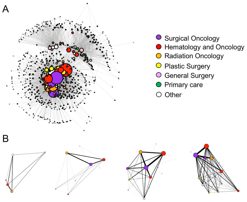
Figure 2. Visualization of the breast cancer physician network.
Each node (circle) represents a physician and the thickness between physicians (weight) represents the extent of patient-sharing occurring between them. Node size corresponds to the number of ties the physician has to others in the network. (A) The complete breast cancer physician network based on having shared patients within the first 12 months of the patient’s breast cancer diagnosis. (B) Examples of four patient care networks.

