Figure 3.
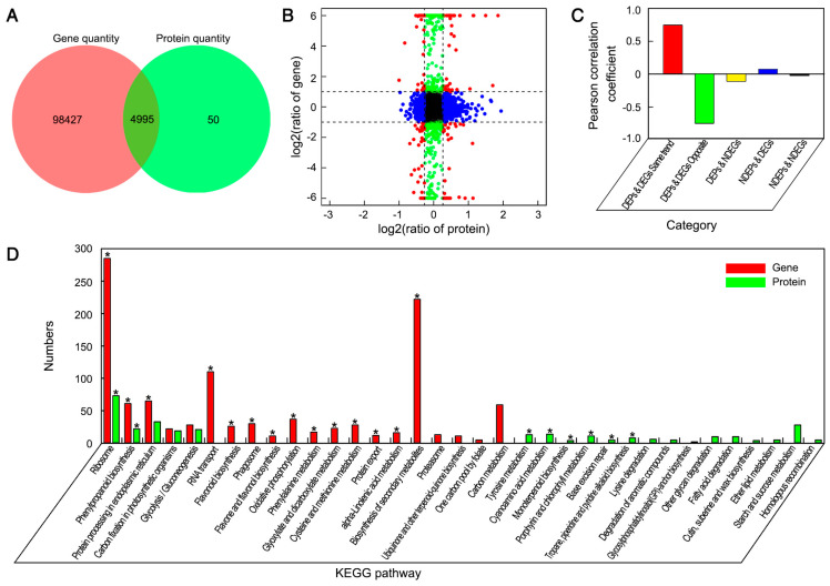
Effects of nano-CaCO3 treatment on the proteome of P. lactiflora inflorescence stems. (A) Venn diagram of the correlation numbers between transcriptome and proteome. The red color represents gene quantity and the green color represents protein quantity. (B) Expression ratios from transcriptomic and proteomic profiles based on quantitative proteins and correlated genes. The X axis represents log2-transformed fold change of proteins and the Y axis represents log2-transformed fold change of correlated genes; significant expression changes are indicated by different colors: blue points, proteins only; green points, transcripts only; and red points, both. (C) Pearson coefficient distribution of the correlation numbers between transcriptome and proteome in five categories. The X axis represents category, the Y axis represents the Pearson correlation coefficient. (D) Pathway enrichment analysis of DEGs and differentially expressed proteins (DEPs). The X axis represents the number of DEGs and DEPs, the Y axis represents the pathway name, the red color represents gene and the green represents protein, and * represents DEG and DEP significantly enriched pathways.

