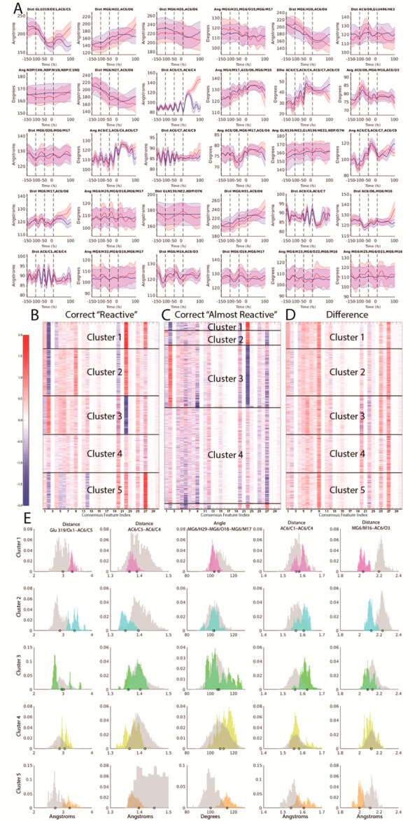
Figure 3.

(A) Average time traces of consensus features across −150 to +100 fs time points with red indicating average reactive traces and blue indicating average almost-reactive traces. Error bars indicate 2 standard errors of the mean at each time point. Vertical black lines indicate time points at −150, −100, −50, and 0 fs where coefficients listed in Table S2 were fit. (B) Z-scores for consensus features (listed in Table S3 and illustrated structurally in Figure S5) evaluated at the 0 fs time point and weighted by their corresponding standardized logistic regression coefficient for all correctly classified reactive trajectories in data set. Dark lines indicate cluster boundaries assigned using k-means clustering with k = 5. Within each cluster, features are sorted by distance from the centroid of the respective cluster (closest to centroid at top). (C) Z-scores for the consensus features evaluated at the 0 fs time point and multiplied by their corresponding standardized logistic regression coefficient for all correctly classified almost-reactive trajectories in data set. Dark lines indicate cluster assignments, based on the closest centroid to the five centroids learned on the reactive features shown in (B). (D) Z-scores differences between reactive features in each cluster and the mean almost-reactive feature set of the corresponding almost-reactive cluster. (E) Histograms of weighted feature weight differences across each of the five reactive/almost-reactive cluster sets. The set of five features shown was determined by computing the top three weighted feature differences by absolute value for each cluster shown in Figure 3D, then taking the union of the resulting set. Magenta corresponds to cluster 1, cyan corresponds to cluster 2, green corresponds to cluster 3, yellow corresponds to cluster 4, orange corresponds to cluster 5, and gray corresponds to the corresponding almost-reactive cluster for the reactive cluster shown in each histogram. Dots indicate representative structures (the reactive or almost-reactive structures closest to the mean of the centroid for each respective cluster) which are shown in Figure S6.
