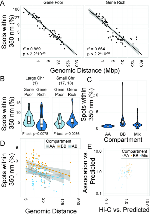
Figure 3: Modifiers of association frequencies.
A: Scatterplots of percentage of spot pairs within 350 nm vs. genomic distance. Line of best fit indicated. B: Violin plots of percentage of spot pairs within 350 nm. C: Violin plots of percentage of spot pairs within 350 nm by compartment. D: Scatterplot of percentage of spot pairs within 350 nm vs. genomic distance. E: Scatterplot of association likelihood vs. Hi-C score, normalized to a distance-based power law model.

